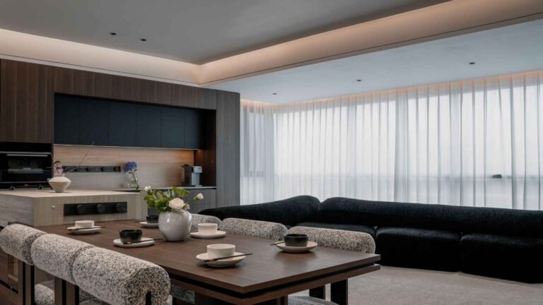
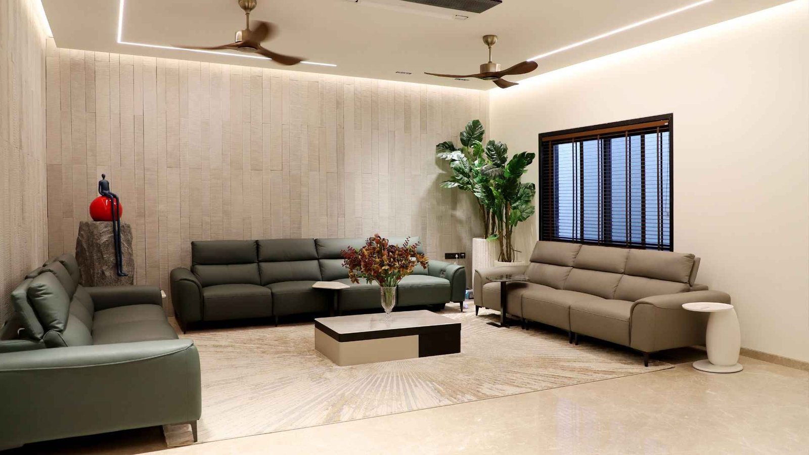
15 Best Living Room Color Combinations for Every Style
Best Living Room Color Combinations
Choosing the right colors can completely transform the look and feel of your living room. The best living room color combination can make a small room feel larger, a dark room feel brighter, or a plain space feel warm, stylish, and inviting.
However, choosing colors is not always easy. With so many shades, furniture styles, flooring options, and lighting conditions to consider, it can be difficult to know which colors will work well together.
The good news is that you do not need to be an interior designer to create a beautiful color palette. A successful living room usually starts with a few carefully selected colors that work together rather than using too many competing shades.
Whether you prefer a calm neutral space, a warm and cozy room, or a bold modern look, there are plenty of living room color combinations that can suit your style.
Quick Answer: What Are the Best Living Room Color Combinations?
Some of the best living room color combinations include beige and white, gray and navy blue, cream and sage green, black and white, blue and beige, and terracotta with warm neutrals.
For a balanced look, choose one main color, one supporting color, and one or two accent colors. Neutral shades usually work best as the foundation, while darker or brighter colors can add personality through walls, furniture, cushions, artwork, or décor.
How to Choose the Right Living Room Color Combination
Before choosing specific colors, consider the size of your living room, the amount of natural light it receives, and the overall atmosphere you want to create.
A color palette that looks beautiful in a large, bright room may feel completely different in a small space with limited natural light.
Ask yourself:
- Is the living room large or small?
- Does it receive plenty of natural light?
- What color is the flooring?
- What colors are already present in your furniture?
- Do you want the room to feel warm, calm, bright, elegant, or dramatic?
- Are you willing to repaint walls regularly, or do you prefer timeless colors?
A good starting point is to choose a neutral base and then add color gradually.
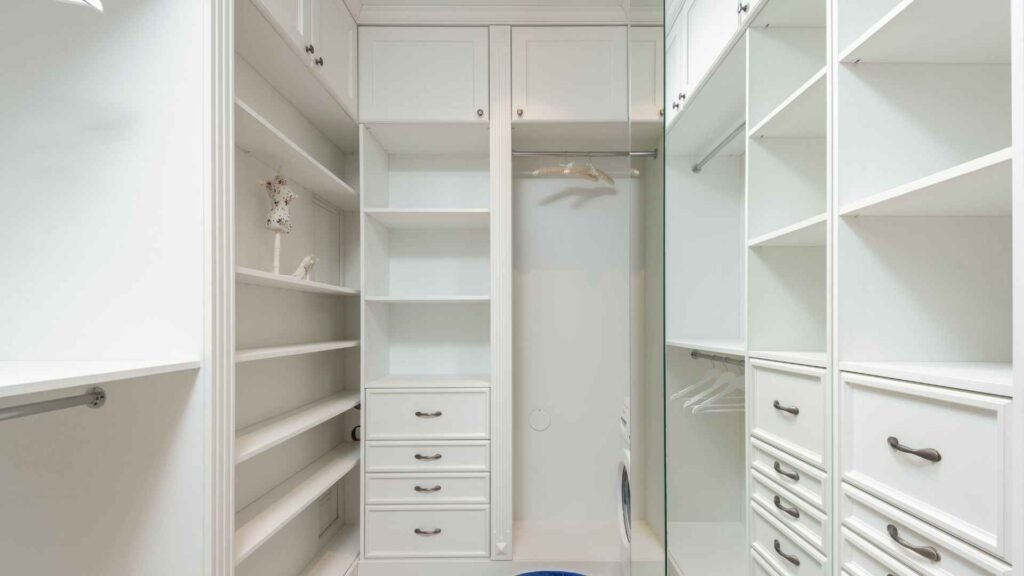
A Simple Guide to Living Room Color Palettes
| Color combination | Best for | How to use it |
|---|---|---|
| Beige and white | Timeless, versatile rooms | Beige walls with white trim and curtains |
| Cream and sage green | Calm, natural interiors | Cream base with sage accents or an accent wall |
| Gray and navy blue | Modern, sophisticated rooms | Light-gray base with navy furniture |
| Blue and beige | Relaxed, balanced spaces | Beige walls with blue cushions or artwork |
| Black and white | Contemporary interiors | White as the base, black for contrast |
| Terracotta and cream | Warm, earthy rooms | Cream walls with terracotta textiles |
| Olive green and beige | Nature-inspired spaces | Olive accents with beige and natural wood |
| White and natural wood | Bright, minimalist rooms | White walls with wood furniture |
| Warm white and soft blue | Airy, peaceful spaces | Warm-white walls with soft-blue textiles |
| Brown and cream | Cozy, traditional rooms | Cream textiles with brown furniture |
1. Beige and White
Beige and white is one of the most timeless living room color combinations.
The combination creates a bright, warm, and welcoming atmosphere without feeling overly plain. White helps reflect light, while beige adds softness and warmth.
You can use beige as the main wall color and add white through trim, curtains, furniture, or accessories.
Another option is to keep the walls white and introduce beige through:
- Sofas
- Rugs
- Curtains
- Throw pillows
- Accent chairs
Natural materials such as wood, linen, rattan, and woven fabrics work particularly well with this color palette.
This combination is ideal if you want a living room that feels calm and easy to update over time.
2. Gray and Navy Blue
Gray and navy blue create a sophisticated and balanced living room.
Light or medium gray can act as a neutral foundation, while navy blue adds depth and contrast.
For example, you might use:
- Light gray walls
- A navy blue sofa or accent chair
- White curtains
- Wood furniture
- Metallic or brass accents
Navy works particularly well as an accent color because it adds visual interest without being as intense as black.
In smaller rooms, use navy carefully. Consider introducing it through cushions, curtains, artwork, or a single accent wall rather than covering every surface.
3. Cream and Sage Green
Cream and sage green are excellent choices for creating a calm and relaxing living room.
Sage green has a soft, natural appearance that works beautifully with warm neutrals. Cream prevents the room from feeling too cool and creates a comfortable balance.
You could use sage green on an accent wall and add cream-colored furniture and curtains.
Other colors that complement this combination include:
- Natural wood
- Beige
- Soft brown
- Black accents
- Muted gold
Houseplants can also enhance this palette by adding texture and natural color.
This combination works well in both traditional and modern interiors.
4. Blue and Beige
Blue and beige is a versatile combination that can feel either classic or contemporary depending on the shades you choose.
Soft blue creates a calm atmosphere, while beige adds warmth and prevents the room from feeling cold.
A simple approach could include:
- Beige walls or a beige sofa
- Blue cushions
- Blue artwork
- White or cream curtains
- Natural wood furniture
For a more dramatic look, choose a deeper blue as an accent color.
Light blue and beige are often suitable for bright, relaxed spaces, while navy and darker beige tones can create a more sophisticated appearance.
5. Black and White
Black and white is one of the boldest and most recognizable living room color combinations.
The strong contrast can create a clean, modern appearance, but balance is important. Too much black can make a room feel dark, especially if the space is small or receives limited natural light.
A practical approach is to use white as the dominant color and black as an accent.
For example:
- White walls
- Light-colored furniture
- Black picture frames
- A black coffee table
- Black lighting fixtures
- Black cushions or patterns
Adding natural wood, plants, or warm fabrics can prevent the space from feeling too stark.
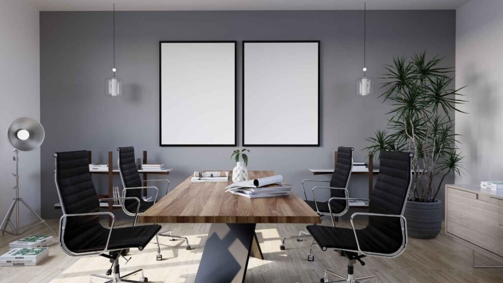
6. White and Natural Wood
White and natural wood create a bright and comfortable living room that works with many interior styles.
White helps make the room feel open, while wood adds warmth and texture.
You can introduce natural wood through:
- Coffee tables
- Shelving
- Flooring
- Side tables
- Picture frames
- Decorative accessories
This palette is especially popular in Scandinavian, minimalist, and modern interiors.
To add personality, introduce a third accent color such as green, blue, terracotta, or soft gray.
7. Terracotta and Cream
Terracotta has become a popular choice for homeowners who want a warm and earthy living room.
Its rich orange-brown tones pair beautifully with cream, beige, white, and natural materials.
You do not need to paint an entire room terracotta. It can be used effectively through:
- An accent wall
- Cushions
- Rugs
- Curtains
- Pottery
- Artwork
Cream or off-white can act as the dominant color, allowing terracotta to add warmth without overwhelming the room.
This combination works especially well with wood furniture, woven textures, and indoor plants.
8. Green and Brown
Green and brown create a natural, grounded color combination.
The colors work well together because they reflect tones commonly found in nature.
You might pair:
- Sage green with light oak
- Olive green with walnut
- Deep forest green with dark wood
- Soft green with beige and natural rattan
For a lighter room, choose softer shades of green and lighter wood tones.
For a more dramatic or traditional living room, deeper green walls can work beautifully with rich brown furniture.
Avoid using too many dark shades at once in a small room, as this can make the space feel heavy.
Tips for Balancing Living Room Colors
Choosing good colors is only part of the process. How you distribute those colors throughout the room also matters.
A simple approach is to use a dominant color for most of the room, a secondary color for larger furniture or selected areas, and an accent color for smaller decorative elements.
For example:
- Main color: Cream walls
- Secondary color: Sage green sofa
- Accent color: Black or warm wood accessories
This creates visual balance without making the room feel overly coordinated.
It is also helpful to repeat accent colors in two or three different areas of the room. For example, if you use navy blue cushions, consider adding a small amount of navy in artwork or a decorative object.
This helps the color palette feel connected.
Consider Natural and Artificial Lighting
Lighting can significantly change how a color looks.
A shade that appears soft and warm in a sunny room may look darker or cooler in a room with limited natural light.
Before painting an entire wall, test a sample in different areas of the room.
Look at it:
- In the morning
- During the afternoon
- At night
- Under artificial lighting
This simple step can prevent expensive mistakes.
In general, lighter colors can help reflect available light, while darker colors add depth and drama.
However, a small room does not always need to be painted white. When balanced with good lighting and lighter furnishings, deeper colors can also create a cozy and stylish effect.
9. Charcoal and Soft Gray
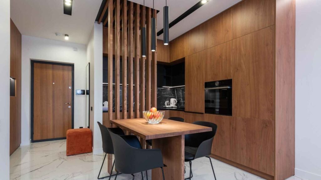
Charcoal and soft gray create a sleek, modern living room with plenty of depth. This combination works especially well if you prefer a sophisticated look without using bright colors.
A lighter gray can be used on the walls, while charcoal works well for:
- Sofas
- Accent chairs
- Rugs
- Curtains
- Lighting fixtures
- Decorative accessories
To keep the room from feeling cold or overly dark, introduce warmer elements such as natural wood, cream textiles, or soft beige accents.
In a small living room, use charcoal sparingly. A charcoal accent wall or a few dark furniture pieces can provide contrast without making the entire space feel enclosed.
10. Blush Pink and Gray
Blush pink and gray create a soft and stylish combination that can work in both modern and contemporary living rooms.
The key is to use muted blush tones rather than overly bright pink shades. Soft gray provides a neutral foundation and balances the warmth of blush.
You might use:
- Light gray walls
- A blush accent chair
- Gray or cream sofa
- Soft pink cushions
- Gold or brass accents
This palette can feel elegant and welcoming without becoming overly decorative.
If blush pink is not your preferred choice, a muted dusty rose can create a more mature and subtle appearance.
11. Navy Blue and White
Navy blue and white is a classic combination that creates a crisp, elegant contrast.
White keeps the space bright, while navy adds depth and visual interest. The combination works well in coastal, traditional, modern, and transitional interiors.
Try using navy through:
- An accent wall
- A sofa
- Curtains
- Throw pillows
- Rugs
- Artwork
White or off-white can be used for the larger surfaces to keep the room balanced.
Adding warm wood, brass, or beige accessories can make the space feel more inviting.
12. Olive Green and Beige
Olive green and beige create a warm, natural palette that feels relaxed and sophisticated.
Beige works well as the main neutral, while olive green adds personality without being as intense as darker greens.
This combination works particularly well with:
- Natural wood furniture
- Linen fabrics
- Rattan or woven décor
- Cream accessories
- Warm metallic accents
An olive green accent wall can become a strong focal point, while beige furniture and textiles keep the overall look balanced.
For smaller living rooms, consider using olive through accessories or furniture rather than painting every wall.
13. Warm White and Soft Blue
Warm white and soft blue create a fresh, peaceful living room.
This color combination works well if you want the room to feel bright without using a completely white palette.
Warm white walls can provide a soft background, while blue can be introduced through:
- Cushions
- Curtains
- Rugs
- Accent chairs
- Artwork
Choose muted blue shades for a relaxed appearance. Soft blue works particularly well with light wood, beige, cream, and natural fabrics.
This combination can make a living room feel open and airy while still maintaining warmth.
14. Brown and Cream
Brown and cream are among the most comfortable and timeless living room color combinations.
Cream helps brighten the room, while brown adds warmth and depth.
You can use brown through:
- Leather sofas
- Wooden furniture
- Rugs
- Accent chairs
- Decorative accessories
Cream can be used for walls, curtains, cushions, and larger textiles.
This palette works particularly well in traditional, rustic, farmhouse, and transitional interiors.
Adding a small amount of green through houseplants can also make brown and cream feel fresher and more natural.
15. Taupe and White
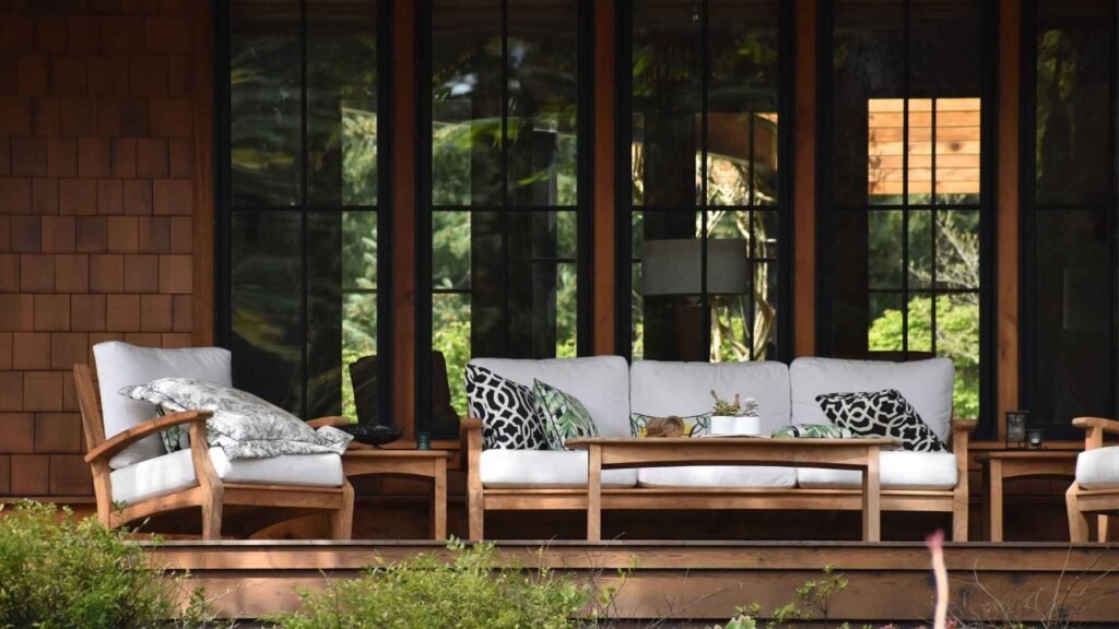
Taupe and white are ideal for homeowners who want a neutral living room with more warmth than plain gray.
Taupe can range from light and soft to deep and sophisticated, making it a flexible choice for walls, furniture, and textiles.
Pairing taupe with white can create a clean and timeless foundation.
You can add texture through:
- Wood furniture
- Woven baskets
- Linen curtains
- Textured cushions
- Patterned rugs
This combination is easy to update because almost any accent color can work with it, including blue, green, black, terracotta, or muted gold.
Best Living Room Colors for Small Spaces
A small living room does not have to be limited to plain white walls.
However, lighter and softer colors can help reflect light and create a more open appearance.
Some excellent choices include:
| Color Combination | Why It Works in a Small Living Room |
|---|---|
| White and beige | Creates a bright, warm, open feel |
| Cream and sage green | Adds color without overwhelming the space |
| Soft blue and white | Creates a light and airy atmosphere |
| Light gray and navy | Provides contrast while maintaining balance |
| Taupe and cream | Adds warmth without making the room feel heavy |
| White and natural wood | Keeps the room bright while adding texture |
If you want to use darker colors, consider limiting them to one wall, furniture, or decorative accents.
A well-designed small living room can still use deep colors successfully, especially when balanced with good lighting and lighter surrounding elements.
How to Use the 60-30-10 Color Rule
The 60-30-10 rule is a simple guideline that can help create a balanced color scheme.
The idea is to divide the colors in your room approximately like this:
60% Main Color
This is the dominant color used throughout the room.
It may include:
- Walls
- Large rugs
- Large furniture
- Curtains
30% Secondary Color
The secondary color provides contrast and supports the main color.
It may appear in:
- Sofas
- Accent chairs
- Curtains
- Rugs
- Feature walls
10% Accent Color
The accent color adds personality and visual interest.
Use it for:
- Cushions
- Artwork
- Lamps
- Decorative objects
- Small furniture pieces
For example, you could use:
- 60%: Warm white
- 30%: Beige
- 10%: Sage green
The rule does not need to be followed exactly, but it can help prevent too many colors from competing for attention.
How to Choose Colors Based on Your Lighting
Lighting should always be considered before choosing a living room color.
A color can look completely different depending on the amount of natural light and the type of artificial lighting in the room.
Living Rooms With Plenty of Natural Light
Bright rooms can often handle deeper colors more easily.
You might consider:
- Navy blue
- Olive green
- Charcoal
- Terracotta
- Deep forest green
Natural light can help balance darker shades and prevent them from feeling too heavy.
Dark Living Rooms
If your living room receives limited natural light, lighter colors can help create a brighter appearance.
Consider:
- Warm white
- Cream
- Light beige
- Soft gray
- Pale blue
- Light sage
Use darker shades through furniture or accessories rather than covering every wall.

Common Living Room Color Mistakes to Avoid
Even beautiful colors can look unbalanced if they are used incorrectly.
Using Too Many Colors
A living room does not need five or six strong colors.
Choose a simple palette and repeat those colors throughout the room.
Ignoring Existing Elements
Before choosing a wall color, consider permanent features such as:
- Flooring
- Fireplace materials
- Cabinets
- Large furniture
- Window treatments
Your new colors should work with these existing elements.
Choosing Paint Without Testing It
Paint can look very different in your home than it does in a store or online.
Test samples on your walls and observe them at different times of the day.
Making Everything the Same Color
Using one color throughout the room can make the space feel flat.
Add contrast through textures, furniture, natural materials, and accent colors.
Following Trends Without Considering Your Style
A trendy color may look beautiful, but you will probably enjoy your living room more if the palette reflects your personal taste.
For permanent features such as walls and large furniture, timeless colors are often a safer choice. Trendier shades can be introduced through accessories that are easier to replace.
How to Make Any Living Room Color Combination Look Better
Even a simple palette can look more interesting when you add different textures and materials.
Consider combining:
- Smooth and textured fabrics
- Wood and metal
- Matte and glossy surfaces
- Soft textiles and natural materials
- Light and dark tones
For example, a beige and white living room can feel much more layered when you add a textured rug, linen curtains, wooden furniture, and woven accessories.
Texture helps create depth without requiring additional colors.
Final Thoughts
The best living room color combinations are the ones that match your home’s lighting, existing furniture, and personal style.
If you prefer a timeless look, combinations such as beige and white, brown and cream, taupe and white, or white and natural wood are excellent choices. For a more modern or dramatic appearance, gray and navy, charcoal and soft gray, or black and white can add strong contrast and personality.
For a softer and more natural living room, consider cream and sage green, olive and beige, or soft blue and warm white.
Start with a simple base color, add a complementary secondary shade, and use smaller accents to bring the room together. Testing colors in your actual living room before making a final decision can also help you avoid costly mistakes.
The perfect color combination does not need to follow every interior design trend. It should create a space that feels comfortable, balanced, and enjoyable for the people who use it every day.
Frequently Asked Questions
What are the best colors to combine in a living room?
Some of the best combinations include beige and white, gray and navy blue, cream and sage green, blue and beige, brown and cream, and olive green with warm neutrals.
What is the best color combination for a small living room?
Light combinations such as white and beige, cream and sage green, soft blue and warm white, or taupe and cream can help a small living room feel brighter and more open.
What colors make a living room look expensive?
Neutral colors combined with deep accent shades often create an elegant appearance. Navy blue, charcoal, olive green, cream, taupe, and warm white can look sophisticated when paired with quality textures and balanced décor.
Should living room walls and furniture be the same color?
Not necessarily. Using different but complementary colors can create more depth and contrast. A neutral wall color with furniture in a darker or softer complementary shade often creates a balanced look.
How many colors should a living room have?
A simple palette of two or three main colors is often enough. You can use a dominant color, a secondary color, and one accent color to create visual interest without making the room feel cluttered.